John Wyatt Greenlee, 9/15/2019
The greatest trick that maps ever played is convincing people that they don’t lie. Even when they’re not trying to lie, maps are still products of cultural convention and they necessarily present a biased view of the world. But we tend to be blind that fact, as demonstrated by a recent editorial in the New York Times. On Sept. 9, 2019 the paper published an essay by Charles Blow titled Maps Don’t Lie that took aim at Donald Trump’s now-infamous palimpsest weather map, arguing that this type of manipulation was a bridge too far. Mr. Blow defends the sanctity of maps and the honesty of cartographers, including a number of people he has worked with, and he is well-justified in urging us to be aware of the role that maps can play in political deceptions. But the premise of his editorial misses a key point: maps are always political on some level, and they all lie. Sometimes they lie intentionally, sometimes with malice, and often for good reasons. But every map lies in its implicit promise to show us the world as it really is. Even hyper-accurate maps are, in the end, only arguments for how we should see the spaces around us.

President Trump and his famous hurricane map. Michael Reynolds/EPA, via Shutterstock
There are whole books addressing these questions, not the least of which is Mark Monmonier’s aptly-titled How to Lie with Maps. A wide range of historians and scholars, including Doreen Massey, Edward Soja, Denis Wood, Henri Lefebvre, Yi Fu Tuan, Barbara Belyea, Ray Craib, and many other have written about how issues of mapping and space work in political and cultural contexts. Brian Harley’s work in the later part of the last century made clear the degree to which mapping is a subjective activity that inscribes the mapmaker’s perspectives, ideas, and biases into images of geographic space. Matthew Edney has written about the uses of mapping as a means of controlling British India and about how the scientific nature of the mapping process granted the British a false sense of knowing the territory – and the people – that they claimed as their own. Thongchai Winichakul wrote about the ways that Siam adopted modern mapping practices to try to combat European colonialism and about how the modern Thai government has used those same maps to project anachronistic twentieth-century national claims backwards in time. European and American mapmakers have a long tradition of writing indigenous peoples off of maps, incorrectly showing vacant spaces that encouraged settler expansion.

Cartographica, Vol. 50 No. 3
I wrote an article several years ago (here) about how three different iterations of the Hawaiian government (Kingdom, Republic, and Territory) created strikingly different maps of the islands’ geography and people. Each map reflected the needs of the government in power at the time, and reflects changing efforts to position Hawai’i within the American political imagination. In 1876 the Kingdom produced a map that sought to convince Americans that Hawai’i was a modern, civilized state, capable of defining and its sovereign space and leading a coalition of Pacific island nations. The Republic, seeking admittance into the Union in the 1890s, crafted a map that drew Hawai’i as a possession of the United States, full of savages to be saved and untapped economic potential to be exploited. And when the Territory sought statehood during the 1930s in the face of anti-minority and anti-Japanese sentiment, Dole produces a map that made showed Hawaiians as harmless and emphasized the islands’ value as a tourist destination. Each map was very different, even though the spaces were the same. What changed was the maps’ underlying political rationale.

Map of Britain by Matthew Paris, circa 1250. BL MS Cotton Claudius D VI, Fo. 12v
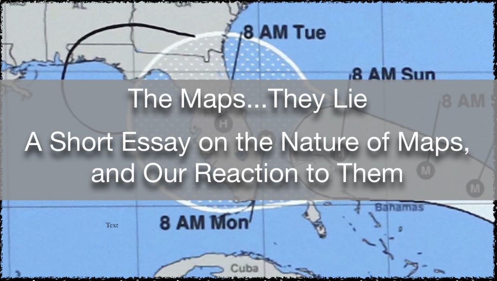
This is not just an issue of modern cartographic practice, either. Matthew Paris’s maps of England in the thirteenth century were highly politically charged in a number of ways, mapping the independent territories of Wales & Scotland as a part of the realm of England (click here for an annotated version of one of his maps). Medieval mappaemundi (maps of the world) such as the famous Hereford map show the earth as a stage for human history and offer a geography based on a religious/political perspective. They connect European Christians to the global space of the End Times, and often expand the territory of the Holy Land in accordance with its spiritual significance. Mappaemundi are not alone in playing with space and time to arrange the world in particular ways for specific reasons. As an example, the 1500 Juan del la Cosa map of Eurasia and the Americas changes scale between the Old World and the New, making the Americas appear far larger & closer to Europe than they actually are. The map also reverses the orientation standard to European mappaemundi, setting the Americas at the top of the map in the space usually reserved for Earthly Paradise. In changing the primary direction in which readers engage with the map, the mapmaker encouraged a new political and religious perspective.
Juan d la Cosa map, circa 1500. Museo Naval, Madrid, Spain
And on it goes; on a global level European mapmaking wrote the world as a space for Europeans, and at a local level it worked to control and order taxable land and peoples. But this is not simply a European issue; various medieval and Early Modern Chinese governments did the same sort of thing. And as European-style mapping became dominate, other cultures adopted it as a way to speak back to colonial powers. In the nineteenth century, Thailand, Japan, and Hawai’i all produced modern trigonometrical national maps that they displayed at World’s Fairs in an attempt to make claims for their equal sovereignty on the global stage. And countries the world over have adopted Western-style cadastral and population mapping to order their peoples and spaces.
These types of internal mapping projects are as politically freighted as international and global ones. For many non-state indigenous communities, questions of how, and how much, to engage with the state mapping efforts stand as ongoing points of contention. Do you put yourself on the map to force your way into the conversation, or do you try to stay off the map and out of the eye of the government? What elements of your cultural heritage do you surrender by acquiescing to being fixed on a map? Who gets to select what parts of local knowledge get charted, and what gets left out of the record? Moreover, how do you reconcile local and indigenous perceptions of space with the scientifically received ways of processing geography that states employ? Keith Basso’s Wisdom Sits in Places touches on these and other problems in trying to understand how to chart the spiritual landscape of Arizona’s Western Apache. Basso wrote about his experience in learning indigenous spatial practice, but he only gave the map itself to the Apache. Decisions like this highlight the deeply political nature of mapping non-state peoples. Questions over how we are mapped, or not mapped, are almost always heavily larded with concerns about power and representation.
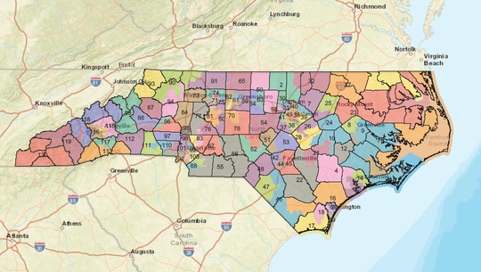
North Carolina legislative district map. From The Citizen Times, 9/3/2019
These kinds of issues have come to the surface recently in obvious ways in the United States thanks to partisan fights over gerrymandering and political representation. In 2019 a state court in North Carolina struck down a deeply gerrymandered legislative map – a map that offers a clear instance where cartography has been used for unscrupulous political purposes. The judges in the case found that the mapmaker had gone to great lengths to craft districts that simultaneously decreased the value of Democratic voters while increasing the power of Republican voters. The map essentially erased some voters from view while making extra space for others, all the while offering a semblance of fairness.
We see the connections between politics and cartography in cases such as North Carolina because they deal with maps that are explicitly political in nature. But we tend to be blind to those connections otherwise, instead reading maps as neutral arbiters of spatial truth. Charles Blow, in his editorial, lauds the devotion to accuracy among the mapmakers he oversaw at the New York Times and at National Geographic, but it is this very idealization of cartographic accuracy that makes it so hard for us to see maps as carrying political or cultural arguments. For several hundred years now the field of Geography has presents itself very much as a science. Consequently, just as we do from other sciences, we tend to assume a certain surety in its claims. We perceive maps to possess a spatial honesty, and we accept their simultaneous claims of cultural honesty, trusting them to show us the world as it is.
Ironically, the more we use maps the worse this conflation gets; we are highly accustomed to maps, but we are not as map-literate as we think. Through smartphones and GPS we increasingly rely on maps in our day-to-day lives, and that use builds trust. And the more we believe in the geographic accuracy of a map the harder it becomes for us to see them as spatial arguments with political stakes. But cartography is always political at some level, and the maps we rely on efface as much (if not more) than they show. We just do not think about it.

Gall-Peters Projection. Wikipedia
All this is without even considering the problems of projection — the world is a sphere and any time mapmakers portray it on a flat surface they have to make decisions about how they want to distort the geography. Not if they want to distort it, but how they want to. If you want to make a map, you have to sacrifice accuracy in some way. The Mercator map distorts the world. The also-popular Gall-Peters projection distorts the world. Every projection does. And a mapmaker has to decide which distortions create the world that they wish to present. And this can be political – Mercator’s projection famously privileges Europe by making it appear large and globally central.
There is a fairly well-known West Wing scene (here) dealing with this, in which a group of geographers argue for changing from the Mercator to the Gall-Peters projection. They lay out all the issues with the familiar Mercator map and champion the multiple fidelities of the Gall-Peters projection. But the scene skates glibly past the fact that Gall-Peters is still making choices about how to warp the world. It simply makes different choices, but now they are ones that the show’s geographers (and many in the real world, as well) find acceptable.

Josh and C.J., shocked to find that the world isn’t what, or where, they thought. West Wing, S2, E16, 2001
This all matters because the conceit underlying that West Wing scene – that mapping can still be neutral if we just get it right – is not one we will be able to hold on to for much longer. For several generations now we have lived in a world that has been essentially cartographically stable, but that idle period is coming to close. In the coming decades climate change will force geographic instability, which will in turn bring political instability at all levels, from intensely local to widely international. And many of the resulting contestations will turn on cartographic questions: whose maps are more believable? Whose maps are older, with more authority? Who has the better claim to space? How do we map lost territory, and which maps will matter if we can reclaim it? Many of these questions will come back again to issues of disalignment between state and vernacular mapping practices, with indigenous peoples and developing countries at distinct disadvantages in presenting their cartographic arguments. The looming crisis demands of us an improved cartographic literacy. We cannot afford the luxury of believing that maps do not lie, or that they are neutral. We need to be able to assess their lies and distortions, and determine which we should accept, and which we should not.
Lastly, I’ll add this final (and somewhat uncomfortable) thought: for all of the furor surrounding Donald Trump’s emendations to his hurricane projection map, his map is not novel in its creation, or in its fabrications – only more blatant. The President simply did in public what mapmakers have long done in the privacy of their studios: he rewrote the world as he wanted to see it.
Keywords: Maps, Cartography, Political Mapping, Gerrymander, Trump, Hurricane, Maps Don’t Lie