 John Wyatt Greenlee and Anna Fore Waymack
About: This talk was delivered October 12, 2018 at Brock University for Boundary Crossings: the 2018 International Conference on Medievalism. We have left in speaker cues. For related work, see our article “Thinking Globally: Mandeville, Memory, and Mappaemundi” in The Medieval Globe, our outline of the book project Insider Information: The Worlds of Medieval Identities, and Greenlee’s Mapping Mandeville Project, winner of the Medieval Academy of America’s 2019 Digital Humanities and Multimedia Studies Prize.
An article-length version, with lots more fun discussion of maps and fantasy as a genre is forthcoming in Studies in Medievalism in 2020. Look for it then!
As always, both authors contributed equally, each more than the other.
Keywords: Tolkien; maps; medieval; medievalism; Middle Earth; fantasy
Anna
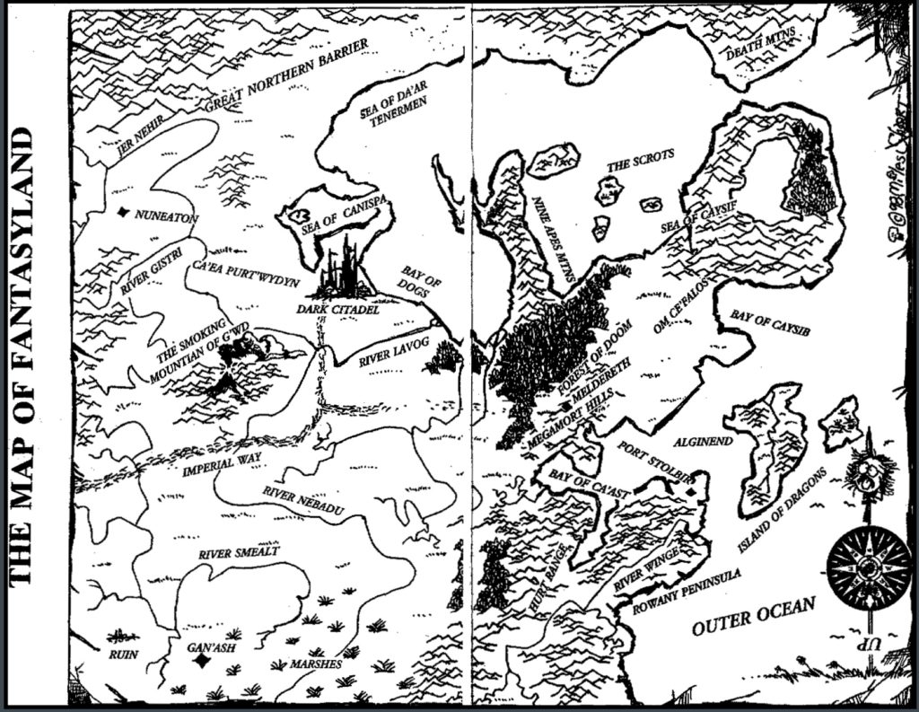
Go down to your local bookstore — an independent local seller or a big national franchise…it doesn’t matter — go to the fantasy section, and grab a book. Open it up, flip past the title page, and you’ll probably expect to see a map. Approximately a third of books published in the fantasy genre begin with a map; it’s become such a trope that Diana Wynne Jones poked fun at the convention in her 1996 tongue-in-cheek Tough Guide to Fantasyland, writing on page one that the reader should “Find the MAP. It will be there. No tour of Fantasyland is complete without one.” The habit that Jones is parodying here starts, as with so much in fantasy, with J.R.R. Tolkien. The hand-drawn maps that bound The Hobbit and preface The Lord of the Rings set a standard echoed by later authors such as C. S. Lewis, George R. R. Martin, Tamora Pierce, and more. In many instances, the maps at the front of these fantasy works reflect Tolkien’s old-world aesthetic, employing pre-modern hillsigns and inscribing place names in gothic or runic lettering. CS Lewis even borrowed Tolkien’s illustrator, Pauline Baynes. Even where styles differ, however, such as in the case of the cogs-and-gears map lead-ins to the Game of Thrones TV series, the placement holds; Tolkien’s decision to introduce his readers to the world of his books with a map has proven monumentally influential.

Fig. 1: J.R.R. Tolkien, Thror’s Map, The Hobbit, 1937
Before Tolkien, fantasy and sci-fi maps, like that included with Twenty Thousand Leagues Under the Sea, were not really related to plot. People have tried to identify Tolkien’s inspiration in Winnie the Pooh’s Hundred Acre Woods and other children’s lit, but we can’t articulate the link between children’s literary fantasy maps and Tolkien’s. For example, Jonathan Crowe, looking at disparity between medieval and fantasy maps, tried out hypothesis that via Tolkien, “modern fantasy maps are the direct descendants of the illustrations in late nineteenth- and early twentieth-century English children’s books.” Still, he can’t trace how they would have scaled up for the Lord of the Rings maps.
And so we don’t know what Tolkien’s inspiration was. We all seem to really want Tolkien’s maps to be medievalisms: he was a medievalist. We associate him with medievalisms. Karen Wynn Fonstad even wrote in The Atlas of Middle-Earth that “Tolkien was envisioning a world much as our medieval cartographers viewed our own.” There are cues to read the maps as medieval, if we squint hard enough — the runes that Tolkien inscribes on his maps, the circling ocean, a distant paradise. It just feels like it oughta be based on the art of medieval maps.
JW
It ain’t.
Here is a late 13th century map of the world, or mappamundi. This one is called the Hereford map. It’s one of the most famous medieval world maps, and one of the only large ones still in existence. For the purposes of clarity we’re going to use a modern reproduction. As a basic orientation: we’re looking eastward, with the Garden of Eden at the top of the map; here is Jerusalem, the Red Sea, the Mediterranean, with Europe at the bottom. The East is the oldest part of the world, and the map shows off the medieval idea that human history moves Westward over time, going from Eden to Babylon to Jerusalem to Rome (see below). As you can will note, the map is jammed full of images — some are historical, some are biblical, some are drawn from Greek mythology — and each one is a pictographic representation of an entire story.
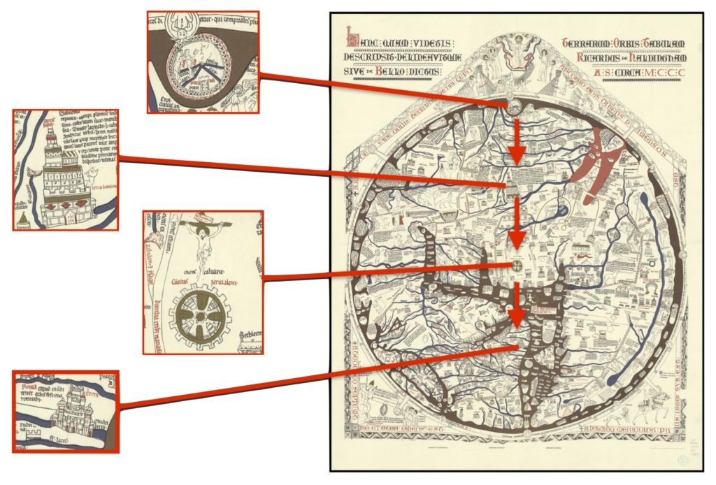
Fig. 2: History moving from East to West. “Reproduction of the Hereford Map.” Stuttgart, GR: Schuler-Verlag, 1989.
Here is another example, from 1260, the Psalter map. As you can see, it represents the world in much the same way as the Hereford map. Neither map pays much attention to specific geographic accuracy …the point here is to broadly locate narratives in general global space: Noah’s Ark; Moses Crossing the Red Sea; the Monstrous Plinian Races. Geographic distortions are of no consequence: the medieval mappamundi have to contain multitudes of stories, and the stories and symbolism are more important than the ratios of geography.
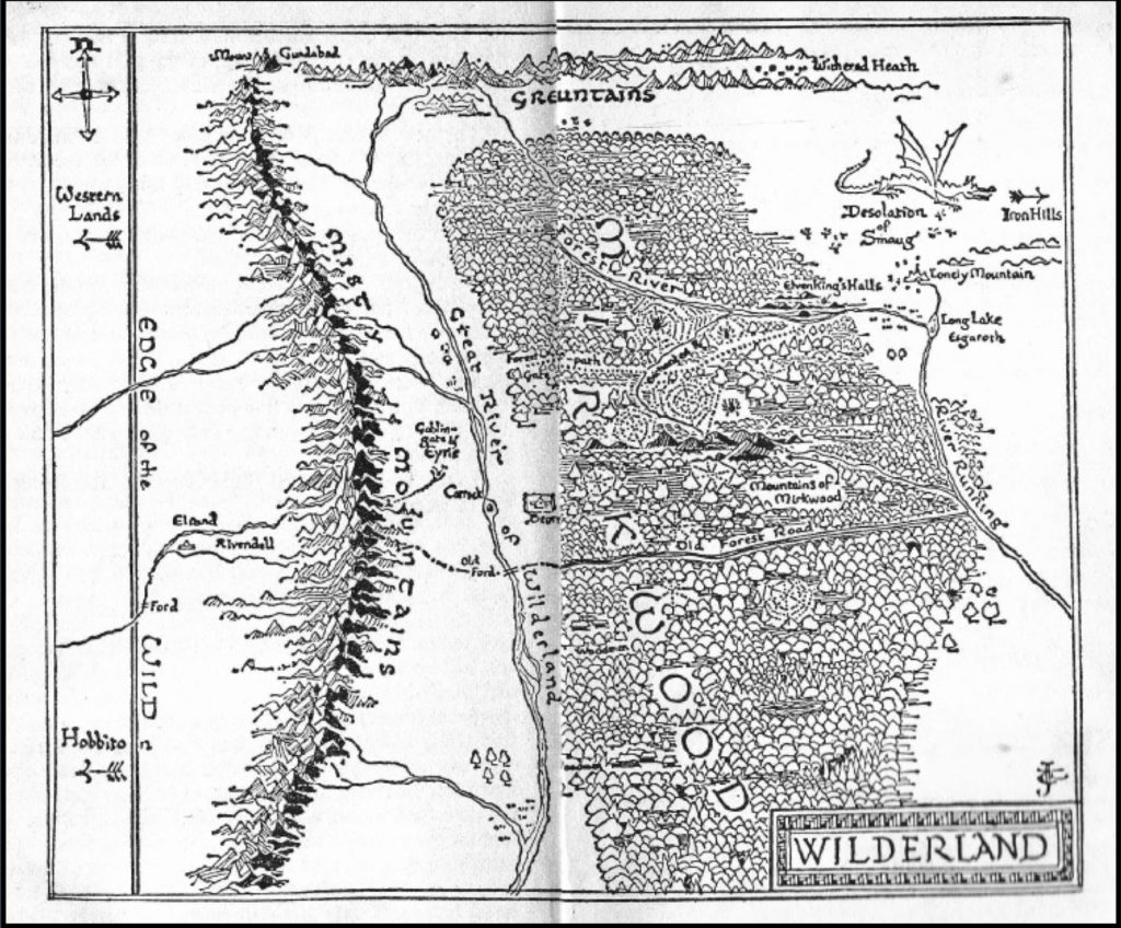
Fig. 3: J.R.R. Tolkien, Map of the Wilderland, The Hobbit, 1937
By contrast, the maps that preface Tolkien’s books use modern imagery and symbolism and cartological techniques: The hill signs are not medieval so much as Early Modern — Tolkien hills and mountains have a 16th-18th century aesthetic. Both the LotR (Fig. 4) and the Hobbit maps (Figs. 1 & 3) include a four-direction compass rose, which did not appear in European cartography until the 18th century. And the maps’ directionality is an issue, as well. The larger world maps in The Hobbit and The Lord of the Rings orient the way a modern map reader would expect, with North at the top.
We might want to read the Hobbit’s regional, dwarven map (Fig. 1), with East at the top, as a medievalism. But that doesn’t work in the context of Middle Earth, where the Paradise equivalent — Tolkien’s Undying Lands — lies to the West. In Middle Earth, West is the origin and the East (with its active volcanism) the younger land. For Tolkien’s Numenorians, the Men of the West, human future moves eastward.
In another complication from the map’s orientation, there’s this huge sea to the lefthand side, something copied over and over by later authors. This isn’t a depiction of the world as medieval artists would have drawn it. It’s a depiction of the Middle Ages as modern authors have imagined it: it’s Europe and the Atlantic.
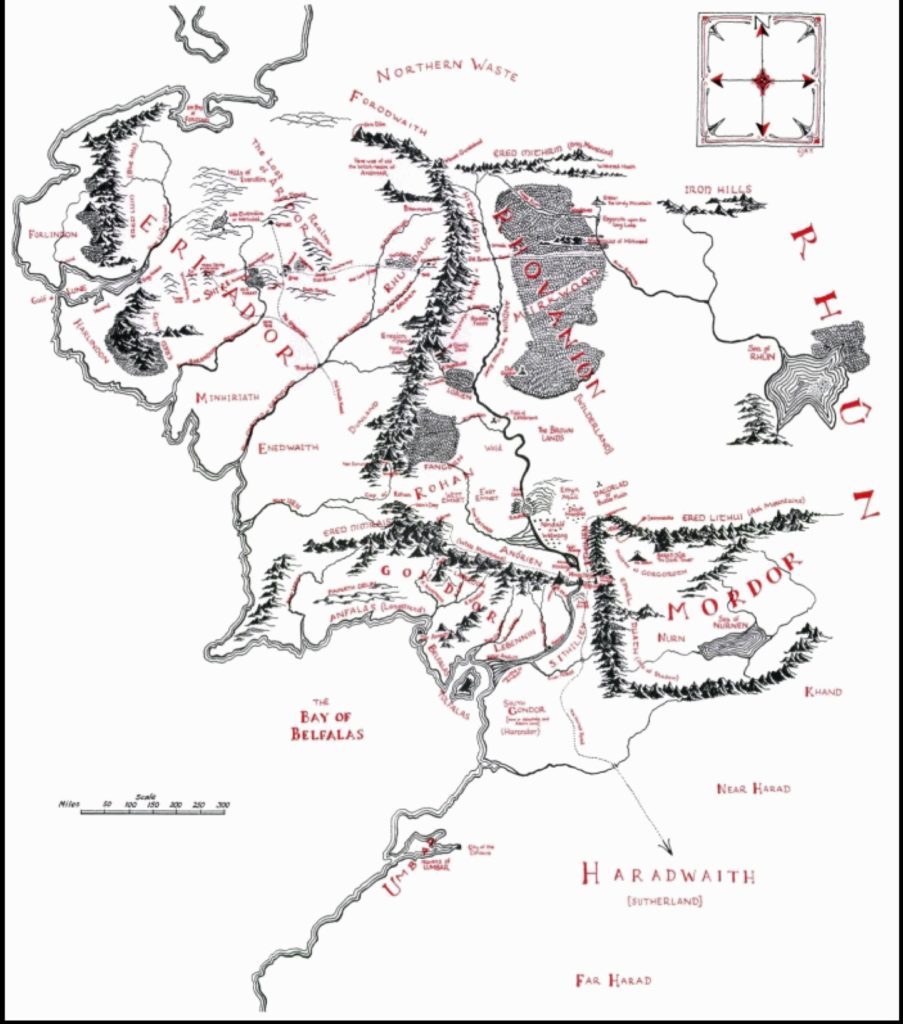
Fig. 4: Christopher Tolkien, General Map of Middle Earth, 1953
Beyond layout, the overall appearance of the map’s contents is also strikingly different. Unlike the Hereford or Psalter maps, Tolkien allows for vast swaths of empty space. His map needs to accommodate only narrow threads of storytelling — more than one, to be sure, as his characters and appendices diverge and wander — but there’s room for empty spaces, At the same time, Tolkien’s images of Middle Earth are much more interested in the seemingness of geographical accuracy. He presents a more plausibly accurate map, on which the location and geographic relationship of specific textual moments matter. His maps let readers follow along with protagonists’ journeys, and comprehend the distance between places. So Tolkien’s maps of Middle Earth aren’t medievalisms.
Fig. 5: Gervase of Canterbury, Mappa Mundi, c. 1200
Anna
Except that, in fact…they are. It’s just that Tolkien was accessing a very different mapping tradition than the one that we tend to be familiar with — one that relied on wholly textual, rather than visual maps to build and describe the world. This, believe it or not, is a map (Fig. 5). Look, it tells you! It’s a map of the world that Gervase of Canterbury, a late 12th century monk, included in his chronicle. It’s a prose map, and that was a thing.
And so even if medieval pictorial maps didn’t care about the distance between places, the textual maps — giving accounts of travels or the geography of countries — did. Intensely! With measurements! And broader medieval texts frequently include some kind of map – a fact that modern readers often miss because we usually only think about maps as images. Ranulf Higden even labels the first book of his Polychronicon the Mappamundi. There can be images included with Higden’s Mappamundi, but the map is the text itself. Gervase of Canterbury here produced this topographical overview of England comprised primarily of tables and lists, and unconcernedly titled it a mappa mundi. Gervase’s relatively cavalier use of the term suggests that he understood himself to be working in a specific, accepted genre. Beyond specifically labeled maps, we find textual maps in works as disparate as Christine de Pizan’s Path of Long Study and the 14th century Travels of Sir John Mandeville.
Importantly, for an entire genre of chronicles and narratives, these textual descriptions of the world most often occur at the start of the work. We see this in foundational works of historians such as the Venerable Bede, William of Malmesbury, Henry of Huntington, and Higden. Matthew Paris, in his histories of Britain, included both textual and visual maps as a part of his introduction. Bede introduces his Historia Ecclesiastica by making Book 1, Chapter 1 “Of the situation of Britain and Ireland, and of their ancient inhabitants.” It locates Britain. It gives its dimensions. The coastline. Cities. Islands. All this before ever diving into the history.
BRITAIN, an island in the ocean, formerly called Albion, is situated between the north and west, facing, though at a considerable distance, the coasts of Germany, France, and Spain, which form the greatest part of Europe. It extends 800 miles in length towards the north, and is 200 miles in breadth, except where several promontories extend further in breadth, by which its compass is made to be 3675 miles. To the south, as you pass along the nearest shore of the Belgic Gaul, the first place in Britain which opens to the eye is the city of Rutubi Portus . . . The distance from hence across the sea to Gessoriacum, the nearest shore of the Morini, is fifty miles, or as some writers say, 450 furlongs. On the back of the island, where it opens upon the boundless ocean, it has the islands called Orcades.
— Bede, Historia Ecclesiastica, 8th C.
Like Gildas, who he borrows from, Bede puts this map at the beginning to ground the very histories and information his text relates. This is, in large part, because of how medieval memory practice worked: to remember a piece of information from a text, you would visualize placing it in a location: literally, in loci or sedes, places or seats. It’s easier to retrieve those specific places and the information you’ve stored in them if you have an overarching framework organizing the places, like….a map! Without a spatial framework the information in the texts does not cohere and cannot necessarily be remembered: these chronicles give you the map first thing as a handy organized receptacle to hold their subsequent information. As you read, you can just slot that info in nicely. So, it’s a prefabricated memory palace: in the shape of a map, up front, with locations for the important things that are gonna happen in the text.
Diana Wynne Jones, The Tough Guide to Fantasyland, 1996
JW
And that’s what we get in The Lord of the Rings, too. In drawing Middle Earth for his readers, Tolkien leaned heavily on this tradition that saw mapping as a prerequisite of world-building and storytelling. We know that Tolkien knew his Bede…his Higden…his Mandeville. He took the practice of having a prefatory cartographical structure for his plot and turned it into a medievalism with these maps that feel medieval even if they don’t visually hold up.
And this remains in modern fantasy novels: Jones is clear in her caricature of the genre that the map goes at the beginning, simultaneously describing this trope of the map on the very first page of her meta-fantastical guide.
Find the MAP. It will be there. No Tour of Fantasyland is complete without one. It will be found in the front part of your brochure…
— Diana Wynne Jones, The Tough Guide to Fantasyland, 1996
Contemporary fantasy luminary N. K. Jemisin is notoriously against including maps because they function as spoilers: every space they show is a space where some plot element will occur — a habit of the medieval textual maps far more so than of their pictorial counterparts. Even the Game of Thrones TV series, usually rife with medievalisms, leads in with that thoroughly unmedieval dynamic maps of cogs and gears. But it’s the introductory placement that matters — in this case, reminding the viewer of the specific, relevant locations, changing each time, for the upcoming episode’s events. It reminds the viewer of place and cues them to remember “where” — or rather, how — that piece of the chronicle left off. These maps – regardless of their artistic or aesthetic choices – are a medievalism by virtue of their placement in the text and their role mediating between reader and textual memory.
…maps are spoilers. No one bothers to put irrelevant points on a fantasy map, so by looking at one you can see exactly where the action of the book is going to go.
— N.K. Jemisin, blog comment, 11 August 2015
A third of all fantasy books include a prefatory map. It’s a convention…a trope. Something to lampoon. But it has its roots in utilitarian medieval tradition, dragged into the present by Tolkien and made visual for a modern, map-literate readership. As Jones notes for us, if there’s a map at the beginning, you can be sure that you’ll “go to every damn place on it.” And you’ll be ready to remember them.